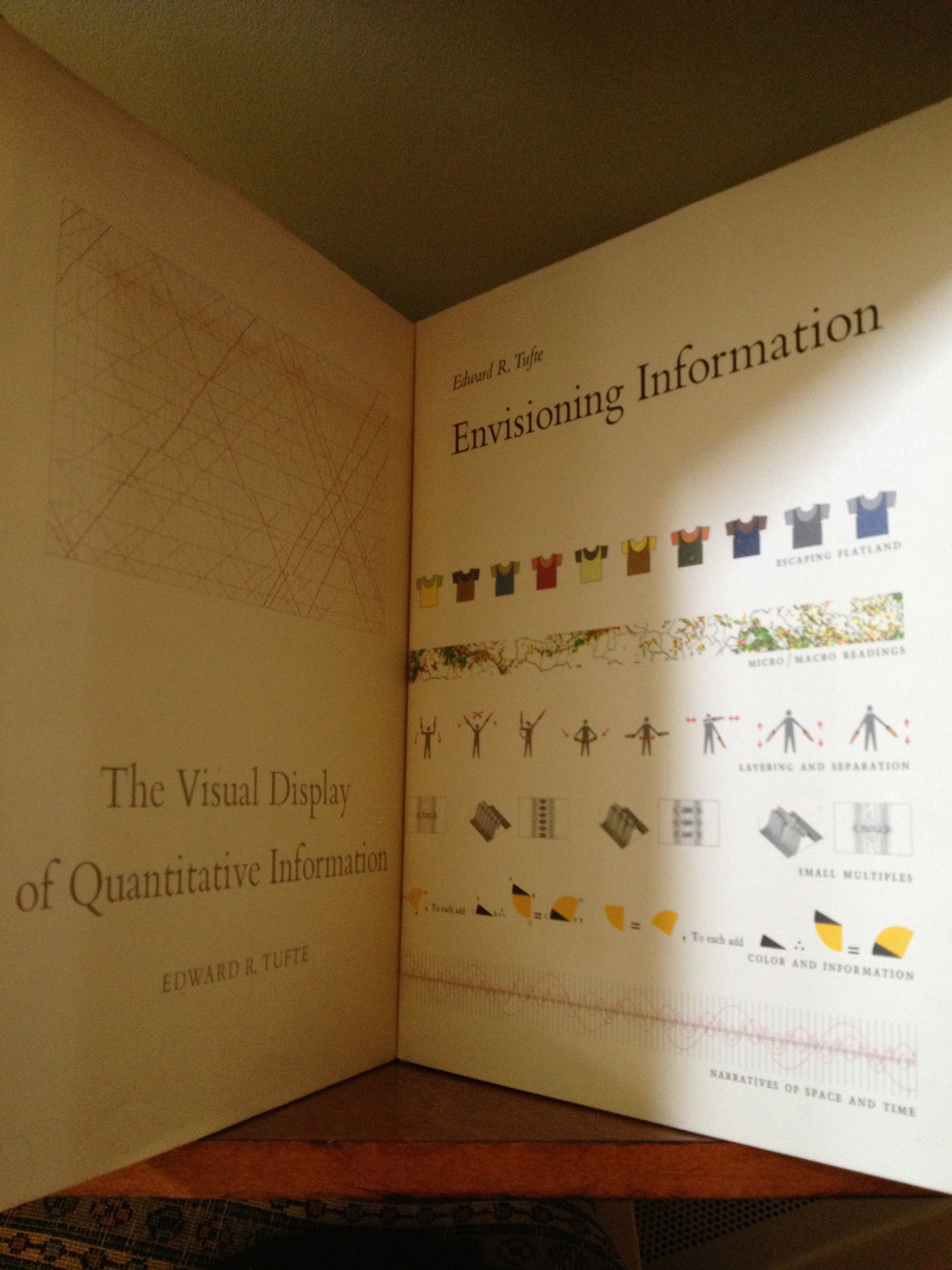
To learn about how to visually display information I often turn to Edward Tufte, a Yale professor, presenter and author of two amazing books: The Visual Display of Quantitative Information and Envisioning Information. He says, “There are two goals when presenting data: convey your story and establish credibility.” For more Tufte quotes read Joe Chernov’s blog post for Eloqua.
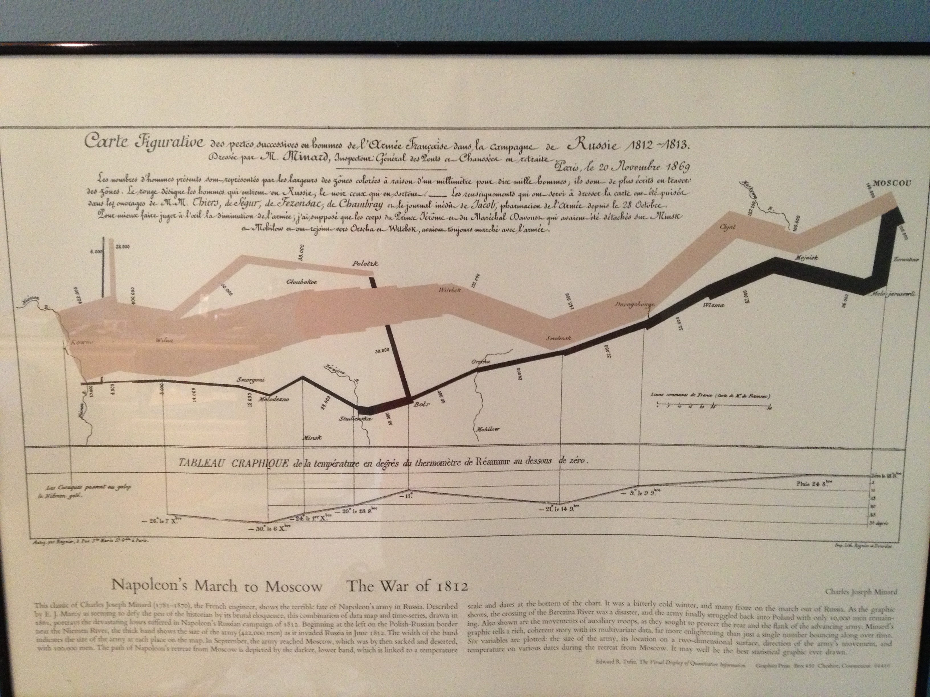
Visual content design is important, but infographics that play with data rather than simplify the message take a chance of confusing rather than clarifying the message. One of my favorite infographics depicts Napolean’s March to Moscow during the War of 1812. It hangs on my office wall and I never get tired of looking at it. Are you tiring of infographics or do they better help you digest information?